Portfolio
Cabela's & Bass Pro Shops Canada Mobile Redesign
Portfolio
Overview
Cabela's & Bass Pro Shops Canada Mobile Redesign
Cabela’s & Bass Pro Shops is a national outdoors retailer selling equipment for ice and summer fishing, camping, hunting, and general outdoor activities. They’re a well-established brand across the United States and Canada with few online competitors.
About
Project Summary
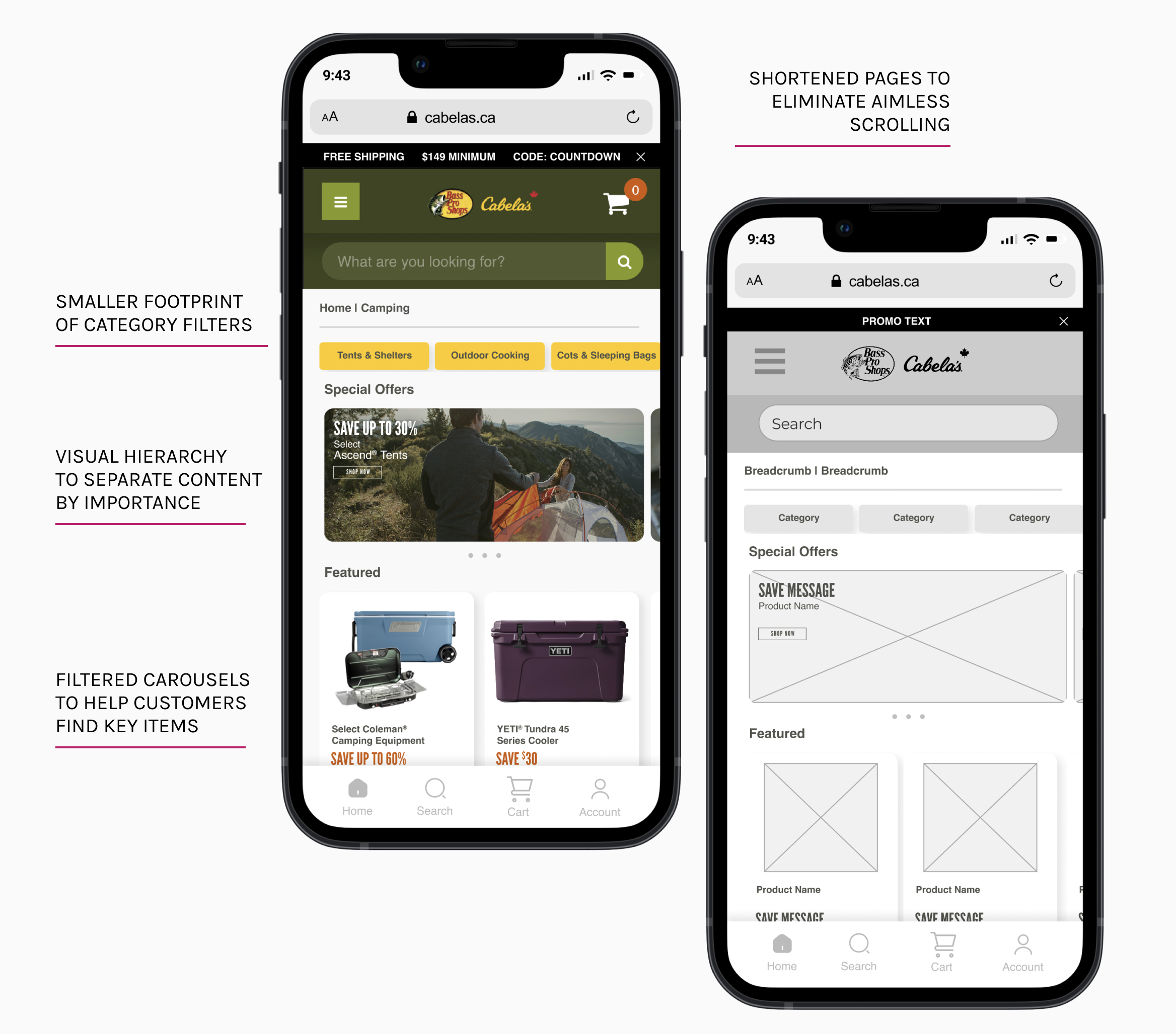
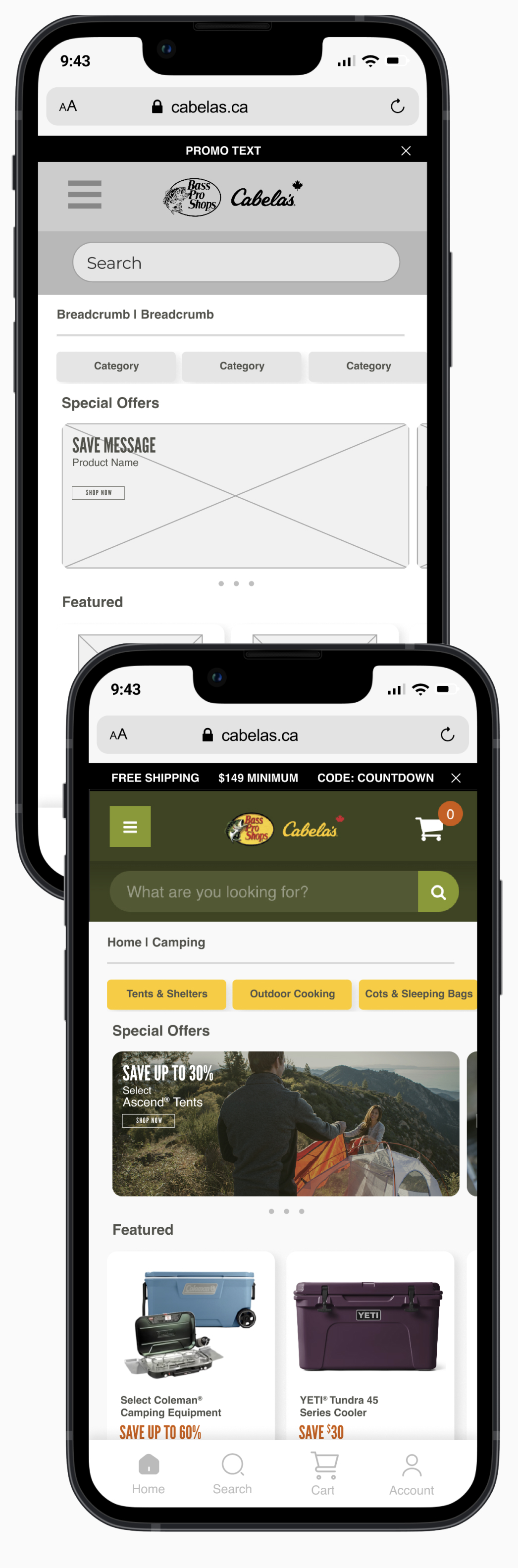
Through quantitative user data, my research found that 60% of Cabela’s and Bass Pro Shops Canada website users shopped on mobile devices, while only 0.85% of those mobile users scrolled past the top 25% of the website. Based on these statistics, I created a mobile redesign of the category pages and the cart checkout.
The original website was very long and cluttered with minimal visual hierarchy. As the research suggested, users were missing out on a large amount of content.
My approach began with conducting several A/B tests throughout the site to gather user behaviour insights and test potential UX changes.
This, combined with competitive analysis and user persona development, I built a foundation to solidify areas for improvement, define a specific user to design for and propose new designs to meet this user’s goals.
Project Goals
The proposed outcomes of my redesign included:
- Optimize the top portion of the shopping pages to ensure that the highest-priority content is visible to the most amount of users.
- Create a visual hierarchy and organize content according to priority
- Create a faster and smoother checkout process overall
My Role
Roles & Responsibilities
A/B Testing | Data Analysis | Customer Persona Development | Competitive Analysis | UX/UI and Graphic Design | Design Pitching | Wireframing | Prototyping | High-Fidelity Designs
Tools Used
Figma | Adobe Photoshop | Google Analytics | Dynamic Yield
Research
Research Summary
Beginning with quantitative user research gathered from two years of A/B testing, the team and I collaborated in fine-tuning several ‘Intent’ audiences captured through Dynamic Yield. These audiences were split into four groups - Unknown, Low, Medium, and High. These users were grouped by their likely intent to purchase on the Cabela’s & Bass Pro Shops Canada website.
For this redesign, I chose our second largest intent group to design for - Low Intent. To give it a more human element, I renamed this group to Amy, The Aimless Browser
Findings
Target Audience A
Amy, The Aimless Browser: “Low Intent” Users - Amy visits the website by accident through paid media or broad Google searches. She isn’t loyal to any brand and will purchase items with good reviews for a cheaper price. Amy is driven by discounts and exclusive offers.
User Story
Amy is a young professional in her late 20s and is open to trying new hobbies and activities. Her current goal is to try outdoor activities like hiking and camping but she doesn't really know where to start or what kind of equipment she needs. She does a lot of online research and wants to get things at the best price. She wants a website where she can do product research as well as purchase items she's interested in.
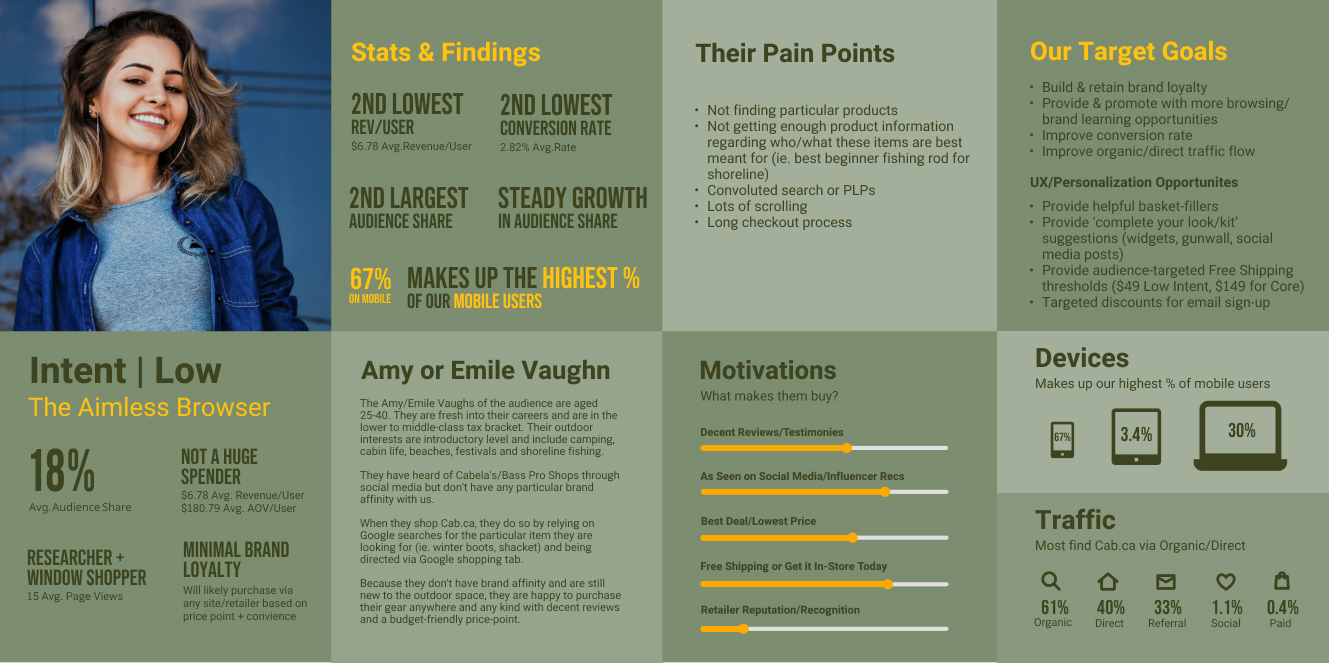
User Behaviours
Motivations
• Is motivated by products with lots of good reviews
• Wants to see items that have been promoted by her favourite influencers
• Free shipping and deals on products push her to buy
User Pains
• Having to search for deals
• Having to scroll through multiple long pages
• Going through convoluted search or product listing pages
• Long checkout process that is difficult to go back and edit previous steps
User Goals
•Seeing featured or suggested items quickly first and being able to view their prices
• Getting lots of detailed product information
• Viewing top deals and being able to purchase sale items easily
"There are so many new activities I want to try. Unfortunately, all of them cost money. I want to try as many of them as I can without spending too much on equipment."
- Amy, The Aimless Browser
Competitive Analysis
My competitive analysis included analyzing two direct competitors. These are other large brands where Amy could also purchase similar products.
Competitor 1
Canadian Tire
Direct Competitor
Canadian Tire is a well-established national retailer selling everything from home goods, home improvement, car repair, and outdoor equipment.
They have a plethora of stores across Canada and pride themselves on being a true Canadian company (not owned by an American parent company)
Strengths
• Well-known across Canada
• Sells a large assortment of product categories
• Has good brand awareness and loyalty
• Website features digital guidance to help customers find and purchase the right products
• Product pages include a lot of customer reviews and product details
Weaknesses
• Category pages are cluttered and can be overwhelming to look at
• Slow load speeds, especially on mobile
• Large amount of similar products which can provoke decision paralysis
Competitor 2
Mountain Equipment Company (MEC)
Direct Competitor
Mountain Equipment Company is a long-standing Canadian hiking, camping, and general outdoors retailer. They pride themselves on offering good equipment at a fair price as well as expert advice from people who are very passionate about the outdoors.
Strengths
• Large national retailer
• Well-known among the outdoor community
• Offers higher-quality brands, often used by professionals
• Brand awareness and loyalty is strong
• Cornered the market of young, trendy professionals with a passion for upscale outdoor adventure
Weaknesses
• Category pages are cluttered and can be overwhelming
• On mobile, category filters are shown as a list making users have to scroll far down to get to the product listings
• Product descriptions are long and might be too much for a user to read, especially on mobile
Design
Design Thinking Summary
The proposed design aimed to address Amy's pain points with the current Cabela's and Bass Pro Shops Canada website:
- Having to sort through convoluted category filtering
- Scrolling through multiple product carousels to find which are on sale
- Searching or scrolling through long pages of unorganized products
- Clicking through a multi-page checkout process
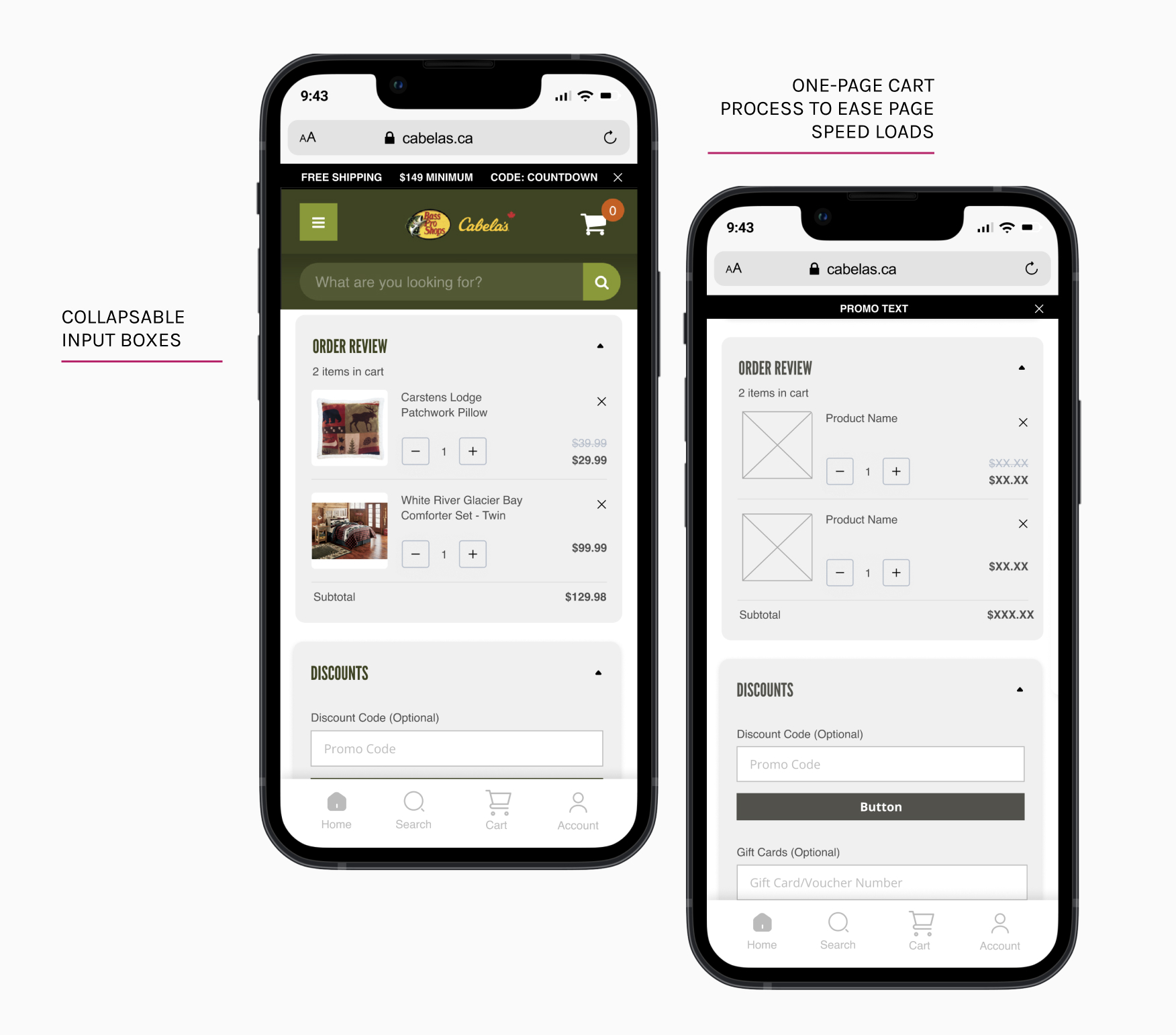
UX/UI Changes
Problem Statement
Amy is a young professional who wants to get into new outdoor activities. She likes to research the best products for the best prices. When she's ready to purchase equipment she wants to easily view the latest/noteworthy products and see whether they are on sale.
UX/UI Improvements
- Visual hierarchy to separate content by importance
- Smaller footprint of category filters
- Consolidated pages to ensure featured deals and promotional offers are viewed by the most users
- Content organized and titled to help customers find key items
- Implementation of more AI-driven product and category recommendations
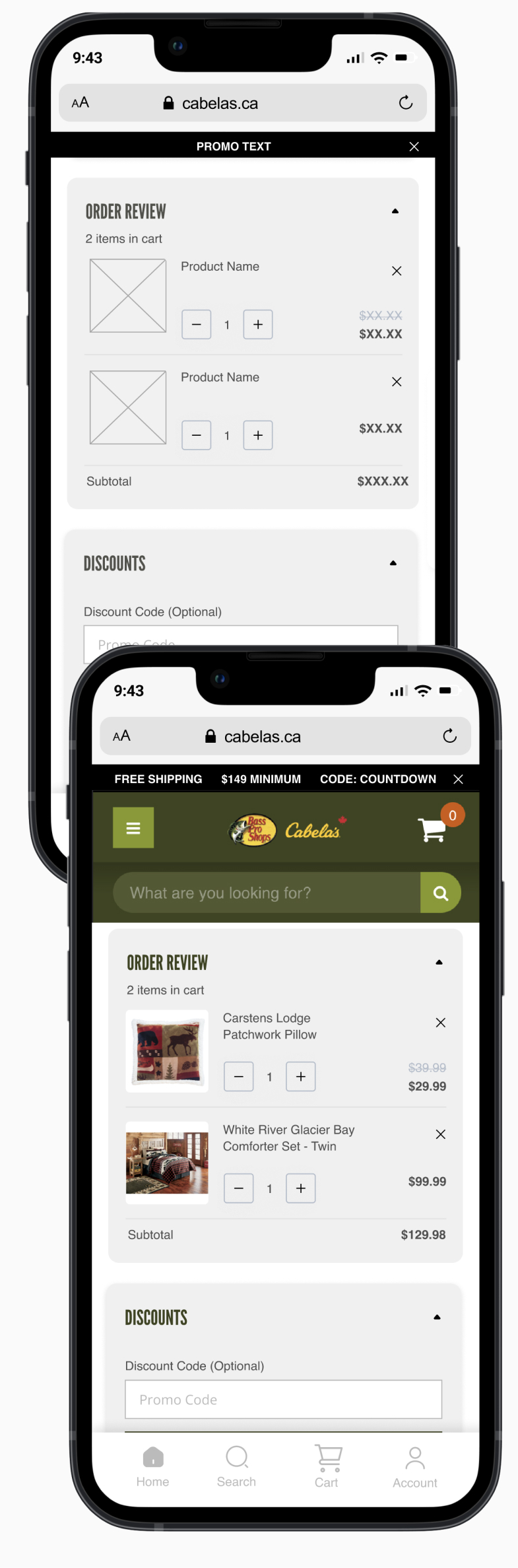
- One-page cart checkout process
- Cart page featuring collapsable input boxes for speed and ease of item editing
Business needs
Improvements to Attain Business Goals
- Buyer Retention: Building an easier and more organized way to shop the several different types of product categories
- Brand Awareness & Elevation: Incorporating new marketing and eCommerce trends to assist in building a more elevated and updated web presence
- Personalization Opportunities: Create spaces that allow for customer personalization to help ensure users always find the products best suited for them
Conclusion
Final Thoughts
By conducting A/B tests, gathering insights from a third-party user research platform, and combining the data with a competitive analysis, I was able to define several points for UX improvement.
With this research, the team and I were able to define the website's four audience groups. For this design project, I aimed to design for the second largest user group - Amy, The Aimless Buyer (Low Intent).
Shopping the site through Amy's eyes and monitoring her behaviour on site, I created a category page and cart process redesign to help eliminate her pain points and create an easy and quick shopping experience that can meet the needs of this particular customer group.