Portfolio
Cabela's & Bass Pro Shops Canada Mobile Cart Redesign
Portfolio
Overview
Cabela's & Bass Pro Shops Canada Mobile Cart Redesign
Cabela’s & Bass Pro Shops is a national outdoors retailer selling equipment for ice and summer fishing, camping, hunting, and general outdoor activities. They’re a well-established brand across the United States and Canada with few online competitors.
About
Project Summary
As part of a larger eCommerce site overhaul for Cabela's and Bass Pro Shops Canada, I led a redesign project proposed to help streamline the checkout process and produce an increase in completed transactions.
Senior leadership had received customer feedback pinpointing issues with the current cart page. Quantitative data from Google Analytics also supported these comments displaying a consistent customer drop-off occurring midway through the checkout process.
My approach began with conducting competitive research to see what design trends were common amongst other eCommerce retailers.
This, combined with a previous user persona development project, I was able to propose a new design to help meet both the user and business needs.
Project Goals
The proposed outcomes of my redesign included:
- Combining the steps within the checkout to help move users along quickly and efficiently
- Change the process from a multi-page checkout to a one-pager to bring the website up to current UX trends
- Create a faster and smoother checkout process overall
My Role
Roles & Responsibilities
Data Analysis | Customer Persona Development | Competitive Analysis | UX/UI and Graphic Design | Design Pitching | Wireframing | Prototyping | High-Fidelity Designs
Tools Used
Figma | Adobe Photoshop | Google Analytics | Dynamic Yield
Research
Research Summary
Combining qualitative customer feedback and quantitative data from Google Analytics, the team and I solidified the need to streamline the checkout process to alleviate user fatigue midway through their transactions.
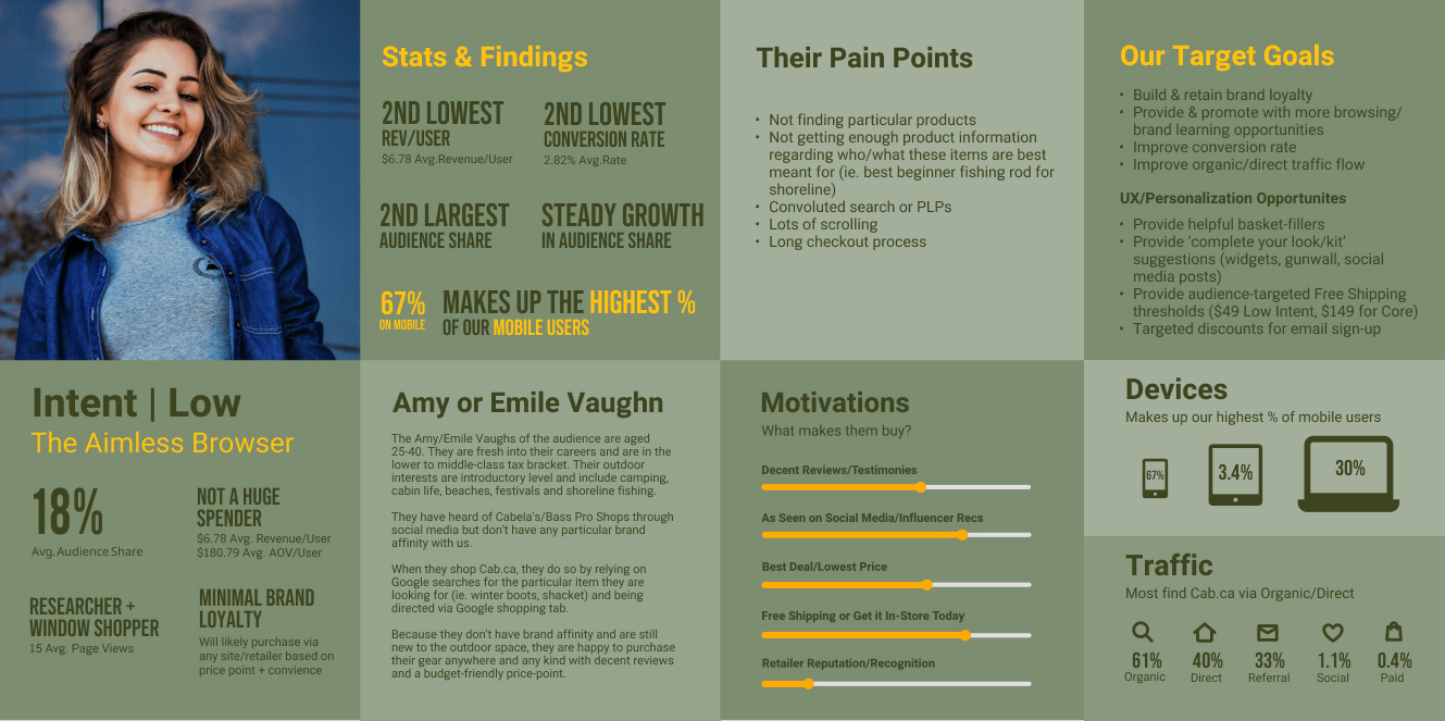
Also utilizing quantitative user research gathered from two years of A/B testing, the team and I collaborated in fine-tuning several ‘Intent’ audiences captured through Dynamic Yield. These audiences were split into four groups - Unknown, Low, Medium, and High. These users were grouped by their likely intent to purchase on the Cabela’s & Bass Pro Shops Canada website.
For this redesign, I chose our second largest intent group to design for - Low Intent. As this is a large customer base, with little to no loyalty to the Cabela's and Bass Pro Shops brand, this audience segment would be the most likely to experience user fatigue during the checkout process and abandon their cart.
To give it a more human element, I renamed this group to Amy, The Aimless Browser
Findings
Target Audience A
Amy, The Aimless Browser: “Low Intent” Users - Amy visits the website by accident through paid media or broad Google searches. She isn’t loyal to any brand and will purchase items with good reviews for a cheaper price. Amy is driven by discounts and exclusive offers.
User Story
Amy is a young professional in her late 20s and is open to trying new hobbies and activities. Her current goal is to try outdoor activities like hiking and camping. She does a lot of online research across multiple eCommerce retailers but is enticed to finally make a purchase when she sees an item for a good price. As she'll happily shop at different retailers, she's easily deterred by convoluted websites and a slow checkout process.
User Behaviours
Motivations
• Is motivated by products with lots of good reviews
• Wants to see items that have been promoted by her favourite influencers
• Free shipping and deals on products push her to buy
User Pains
• Having to search for deals
• Having to scroll through multiple long pages
• Going through convoluted search or product listing pages
• Long checkout process
User Goals
• Viewing top deals and being able to purchase sale items easily
• Easily review her purchases and edit her cart if needed
• Getting lots of detailed product information before purchasing
"There are so many new activities and products I want to try. It takes me awhile to finally decide to buy something. When I do, I feel like I have to buy it fast before I change my mind."
- Amy, The Aimless Browser
Design
Design Thinking Summary
The proposed design aimed to address Amy's pain points with the current Cabela's and Bass Pro Shops Canada checkout process:
- Having to go through multiple pages to purchase
- Having to wait for each page to load separately at each step
- Not being able to review or edit her order before making the final purchase
UX/UI Changes
Problem Statement
Amy is a young professional who wants to get into new outdoor activities. She likes to research the best products for the best prices. She's enticed to buy when items she's interested in go on sale. As it takes her a while to decide to purchase and gets easily frustrated by online shopping, she needs to be able to easily and quickly checkout.
UX/UI Improvements
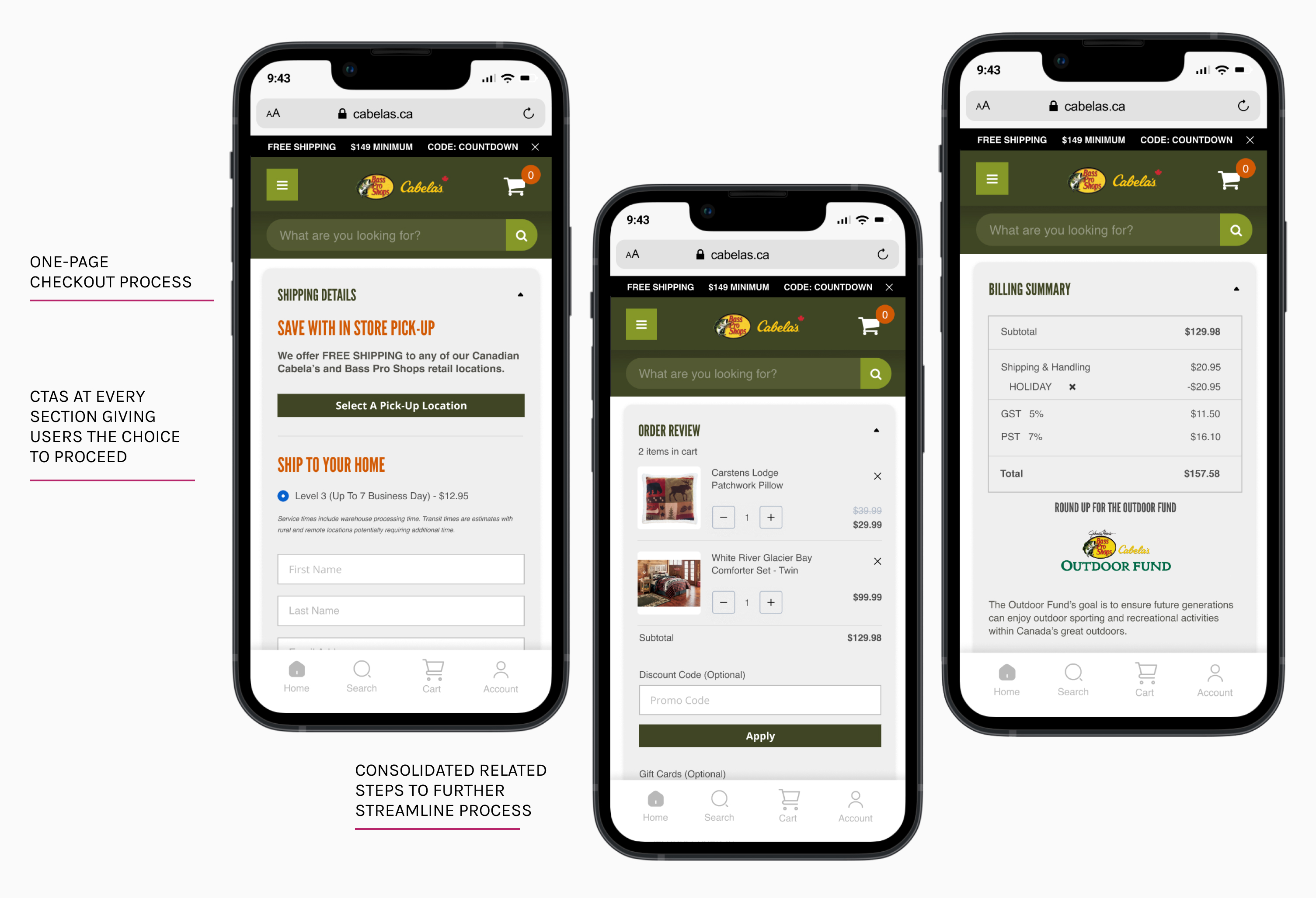
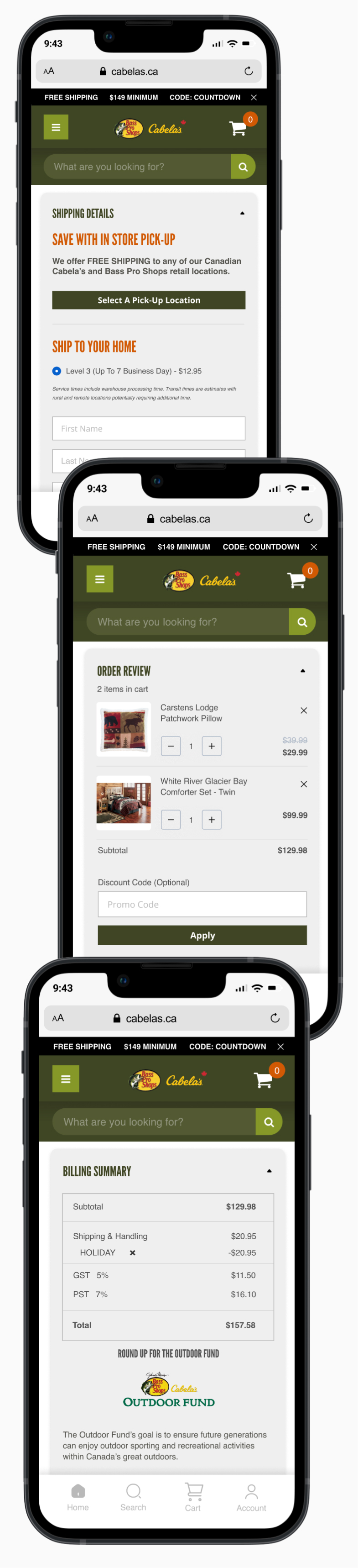
- One-page cart checkout process
- Cart page featuring collapsable input boxes for speed and ease of item editing
- Consolidated multiple steps to streamline process
Iterations
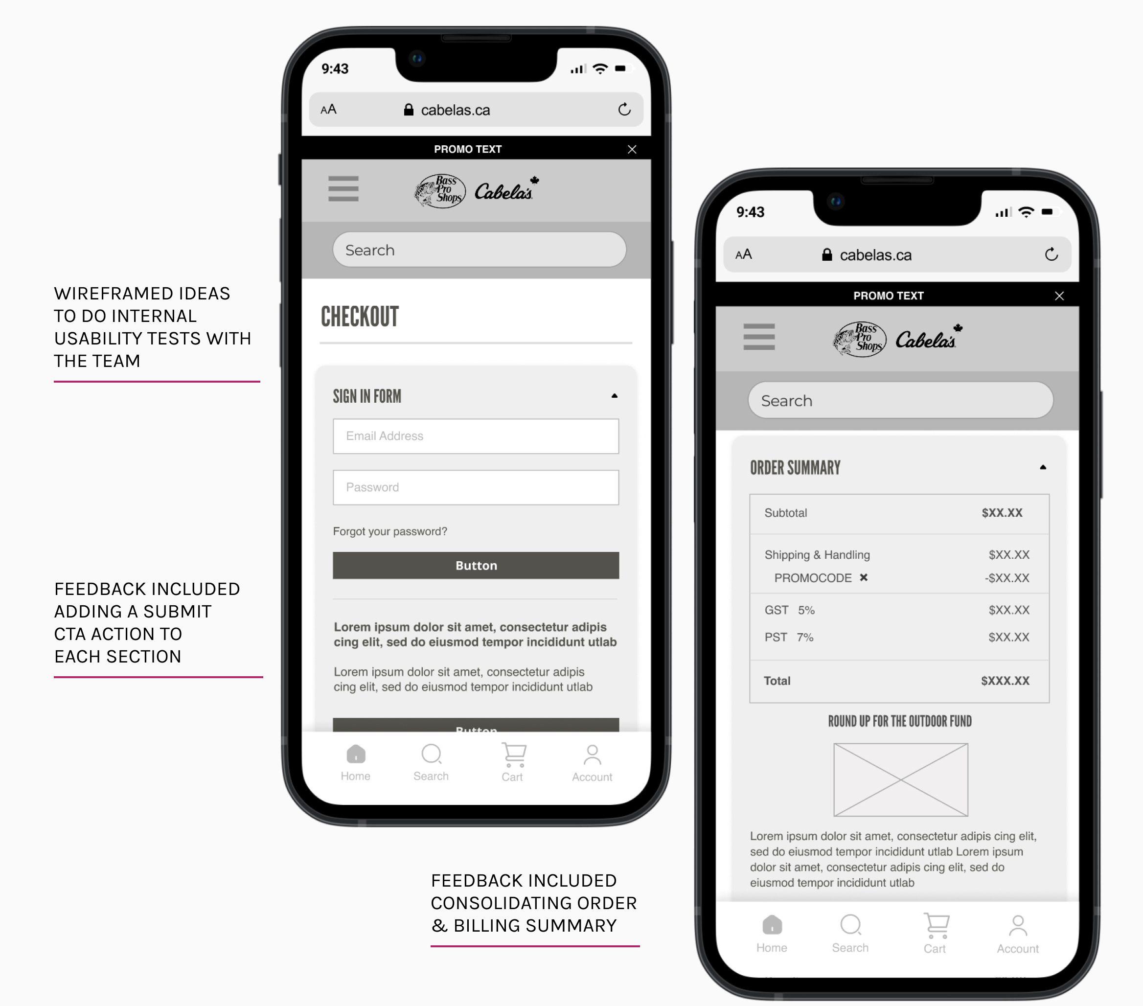
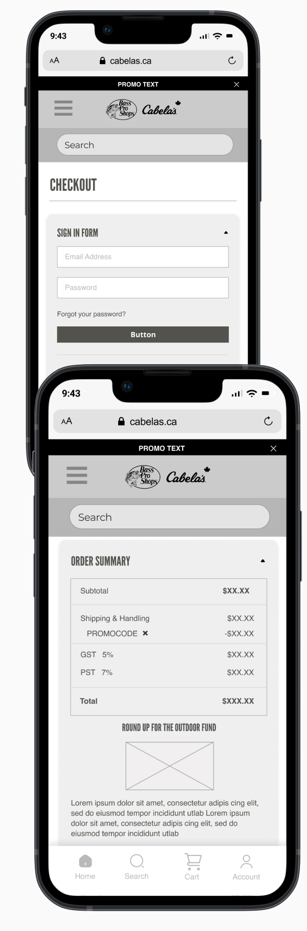
Wireframing & Usability Testing
Digital wireframes were created to present overall ideas to stakeholders. A basic prototype was also presented to acquire further functionality feedback.
Usability Feedback
- Adding 'Submit' action CTAs to every section to give users the choice to proceed
- Consolidating related steps like order and billing summary together to shorten overall process
Business needs
Improvements to Attain Business Goals
- Buyer Retention: Building an easier and quicker checkout process to create a smooth experience for the customer
- Brand Awareness & Elevation: Incorporating updated eCommerce trends to assist in building a more elevated and updated web presence
Conclusion
Final Thoughts
By combining qualitative customer feedback, and quantitative data from Google Analytics and conducting a competitive analysis, there are several points for UX improvement defined.
For this design project, I designed for the second largest user group - Amy, The Aimless Buyer (Low Intent).
While going through the checkout process through Amy's eyes, I created a streamlined cart process to help eliminate her pain points and create an efficient shopping experience that can meet the needs of this particular customer group as well as the ultimate goal of the business - conversion.