Portfolio
Sound, Phrase & Fury
Portfolio
Overview
About Sound, Phrase & Fury
Sound, Phrase & Fury (SPF) is an independent music magazine highlighting independent artists from all over the world. It features rock, pop, pop-punk, punk, indie-rock, and folk musicians. It required a brand overhaul to keep up with reader demands and UX trends.
About
Project Summary
I was in charge of everything from a complete rebrand to UX/UI design with WordPress and interactivity development.
The original website was in a blog format which presented readability issues. As it was a marketing and UX project, the goal was to offer a better experience for online readers while propelling the brand forward and appealing to a new, broader audience.
My approach began with an internal marketing, UX, and competitive analysis. This research provided a foundation for me to solidify the magazine’s new image, define a specific user to design for, and create improvements to meet this user’s goals.
My involvement included analyzing the current website’s usability, recreating a new brand logo and identity, pinpointing a target user, creating high-fidelity designs for desktop & mobile, coding a live site using WordPress and and writing and designing a comprehensive marketing plan.
Project Goals
The proposed outcomes of my redesign included:
- Creating a more upscale website featuring article and video-friendly layouts
- Build a new brand identity and comprehensive marketing plan
- Create an overall look and feel that appeases the magazine's loyal following while appealing to a new, broader audience
My Role
Roles & Responsibilities
UX/UI and Graphic Design | High-Fidelity Designs | UX & Marketing Analysis | Competitive Analysis | Marketing & Business Planning | HTML, CSS, Javascript & PHP Coding
Tools Used
Sketch | Adobe Photoshop | Adobe Illustrator | Adobe InDesign | WordPress
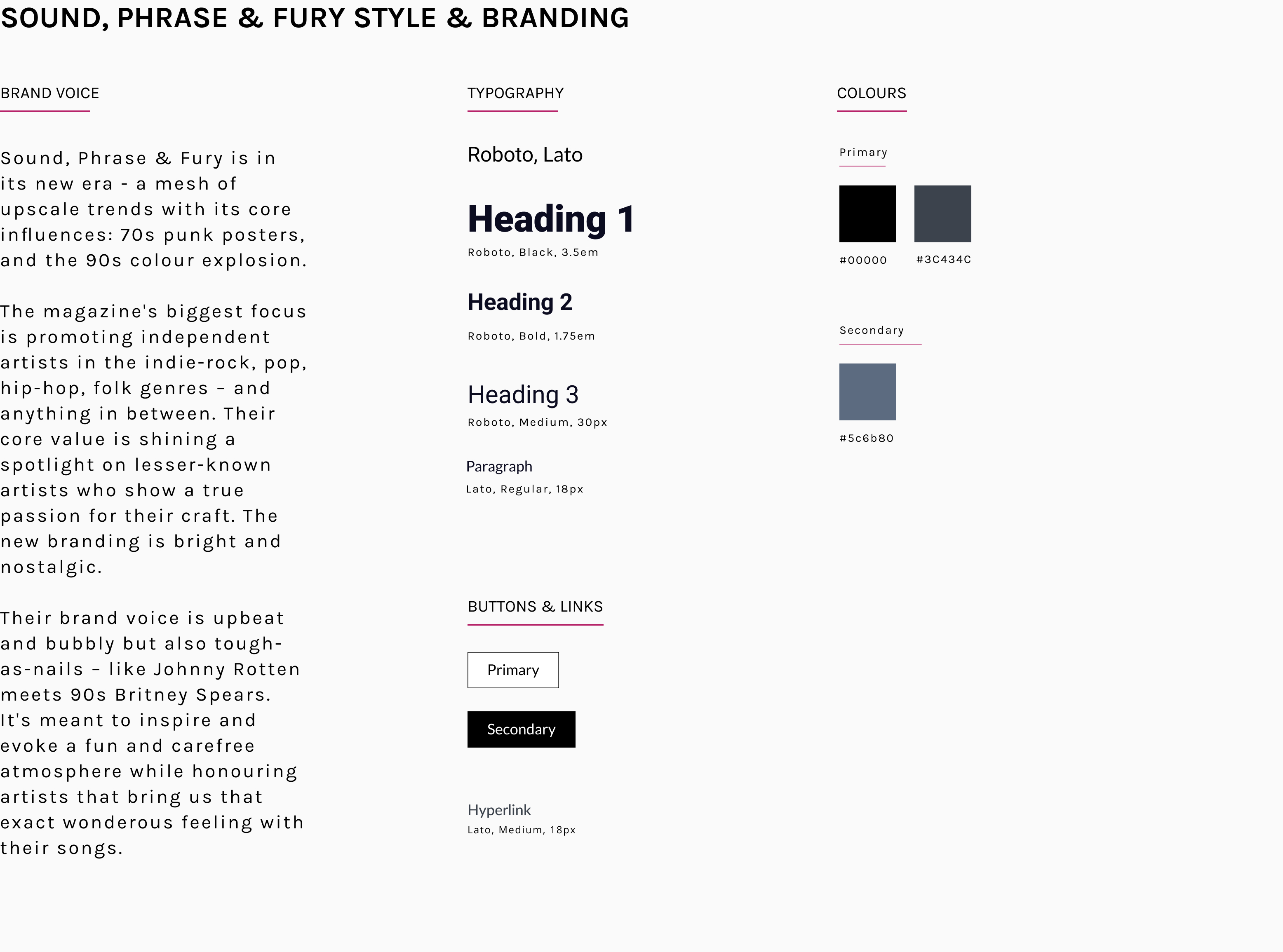
Brand & Style Guide
Research
Research Summary
Beginning with internal analysis on Sound, Phrase & Fury, qualitative user research, a competitive analysis, and a UX/UI website analysis, I defined user pain points for Target Audience A - Joey, The Indie Queen - the main user for this redesign.
Findings
Target Audience A
Joey, The Indie Queen - Joey loves being up-to-date with the latest music news. She reads multiple indie music websites per week and likes when content is updated often. She is very tech-savvy and is easily frustrated when she needs to search for the latest articles.
User Story
Joey is a young professional in her 30s who is always on the move. She enjoys listening to new music and reading about it on her phone. She wants a quick and easy way to access the latest articles and find the content she's interested in, such as the newest music videos or artist interviews.
User Behaviours
Motivations
• Is motivated by interesting and in-depth articles
• Wants to be able to sort through content easily
• Wants to stay up-to-date with the latest music news
User Pains
• Searching through multiple page levels to find certain types of content
• Not being able to differentiate between an editorial post and a video premiere
• Having to read through multiple articles instead of knowing which are the most interesting or worthy of being highlighted
• Viewing hard-to-read articles on a mobile phone due to thin layouts
User Goals
• Seeing the best and featured articles right away
• Going straight to the video premieres quickly and easily
• Having a nice article layout that is easy to read on smaller screens
"There’s so much new music coming out, it’s so hard to keep up sometimes. It’s nice when a website shows me the newest and coolest articles first."
- Joey, The Indie Queen
Competitive Analysis
My competitive analysis included analyzing two direct competitors. These were other well-known music websites that Joey would likely also read when she wants to see the latest artists.
Competitor 1
Paste Magazine
Direct Competitor
Paste Magazine is a long-standing independent music and entertainment website. They cover music, film, and TV news.
The website is based in the United States and is well-known among the music industry. They have access to large-scale festivals and events.
Strengths
• Well-known in the indie music, film, and TV scene
• Features international acts as well as independent artists
• Has a full staff of writers so content is updated often
• Well-established and has access to bigger names than smaller magazines
Weaknesses
• Homepage is plain and looks very outdated
• Articles on the homepage don't feature any summaries, users have to click to see what it's about
• Mobile-site looks very cluttered and unorganized
• Overall branding seems nonexistent
Competitor 2
Alternative Press Magazine
Direct Competitor
About: Alternative Press Magazine is a long-standing independent music magazine and website. They cover a widerange of genres in the alternative scene. The website is based in the United States and is basically the Rolling Stone magazine of their scene.
Strengths
• Well-known among their specific music industry
• Features a mix of international and smaller artists
• Homepage is clean and organized by article type
• Has a full writing staff so the website is frequently updated
Weaknesses
• Article summary font is small and could pose accessibility issues
• On mobile, the featured article looks the same as all the rest and it's hard to tell that it's a highlight
• Website doesn't seem to have clear branding and looks very templated
Design
Design Thinking Summary
The proposed design aimed to address Joeys’s pain points with the current Sound, Phrase & Fury website:
- Having to search through multiple pages of blog format posts to find certain types of content
- Not knowing what articles are editorials or which ones have featured videos
- Lack of attention to featured articles, not knowing what is a noteworthy read
The proposed design also aimed at pleasing readers who have been there from the start while propelling the brand forward and appealing to a new, broader audience.
UX/UI Changes
Problem Statement
Joey is a young professional who reads about and listens to music while she's on the go. She wants a quick way to see the latest music news on her favourite website. She’s open to scrolling through the site but needs an easier way to find which articles are the newest and worth her time.
UX/UI Improvements
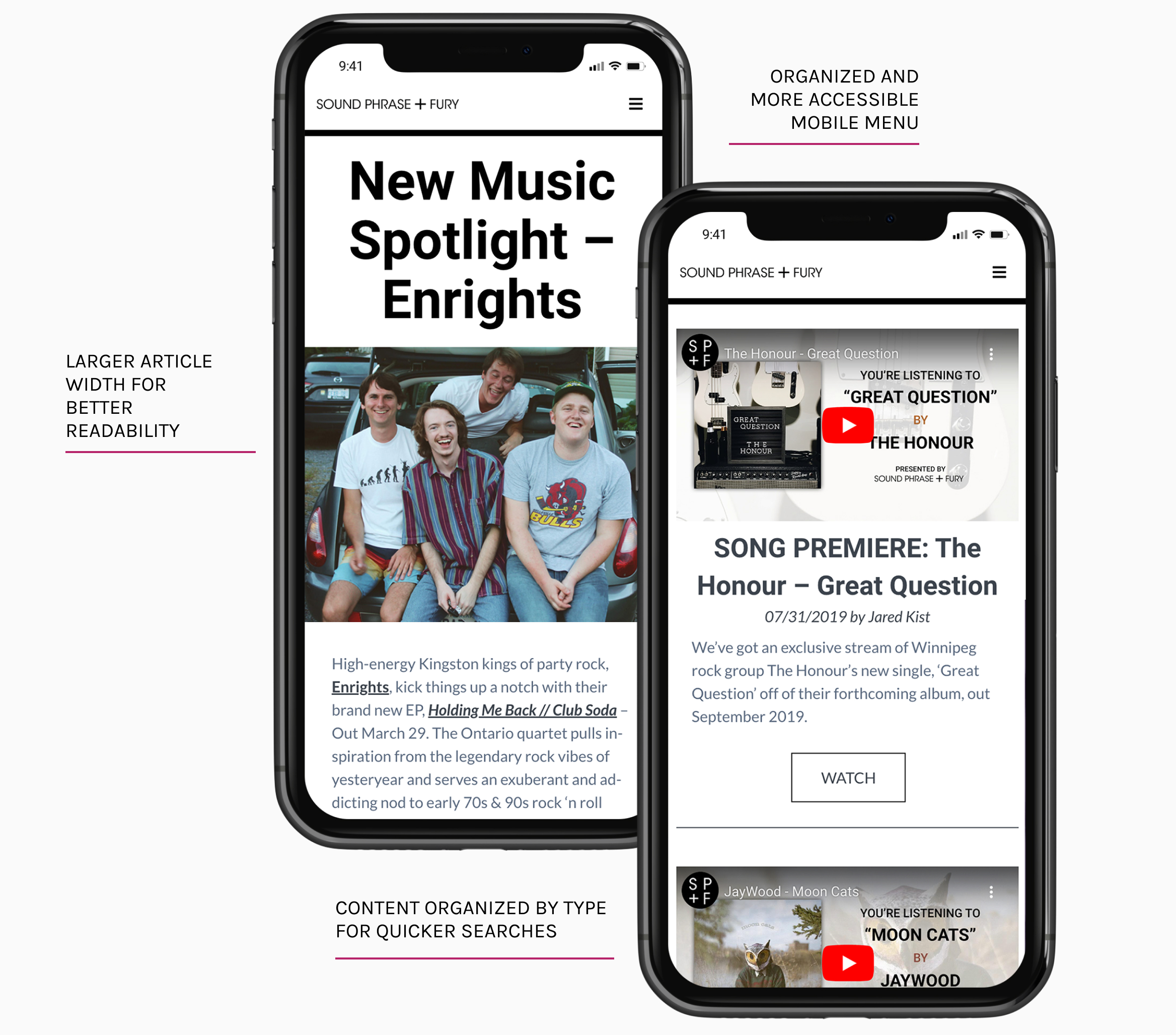
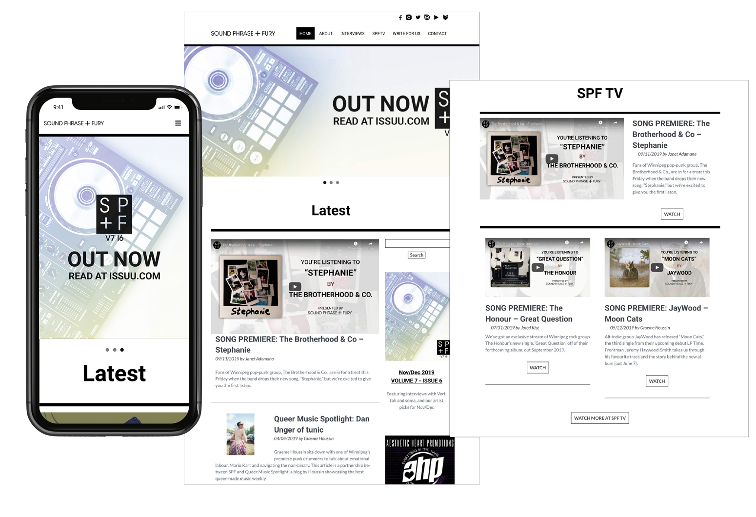
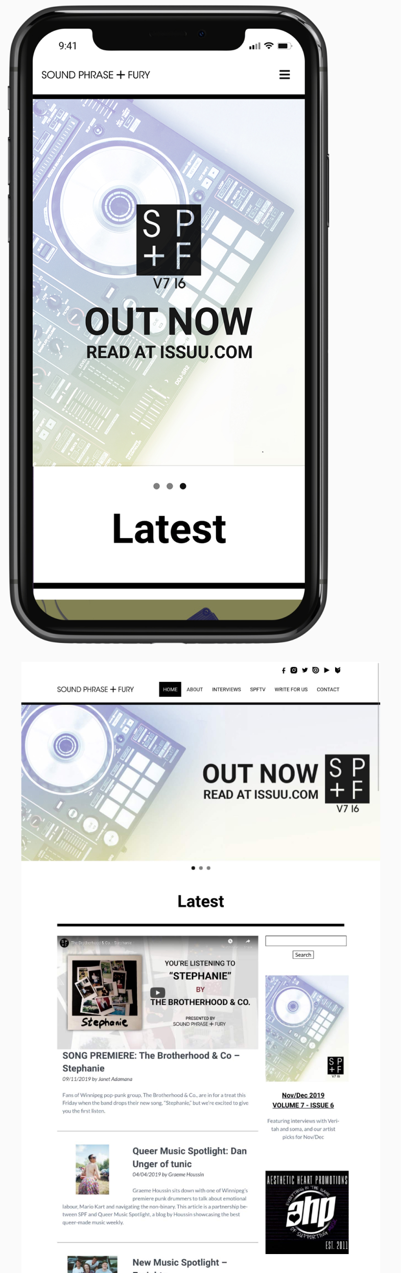
- Eye-catching slider to promote featured articles
- Content organized by type for quicker access to relevant articles
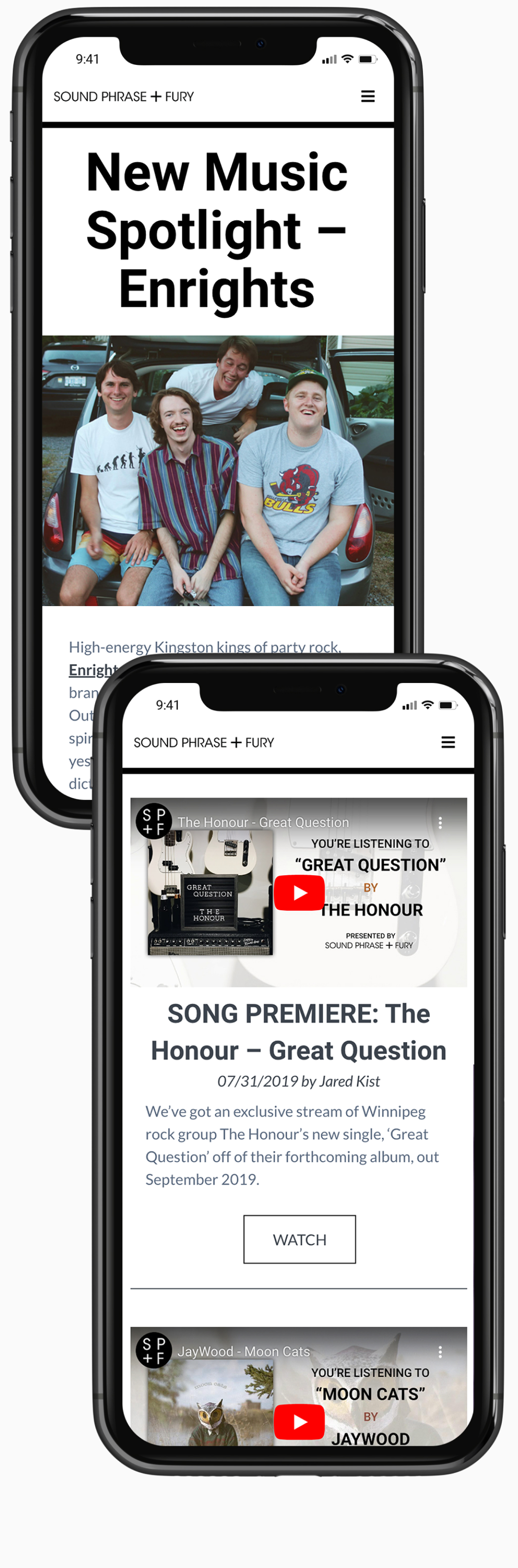
- Larger width layout for a better presentation of editorials and videos
- Organized and more accessible mobile menu
Business needs
Improvements to Attain Business Goals
- Reader Retention: A cleaner and easier-to-read layout to help users feel comfortable on-site and want to return
- Brand Loyalty & Awareness: Creating a sleek new logo and overall brand that balances the magazine's old influences with current design trends.
Conclusion
Final Thoughts
By analyzing Sound, Phrase & Fury from a website and marketing perspective, I defined several points for improvement.
Pairing internal analysis with qualitative user research with real Sound, Phrase & Fury readers, I found a main target user for the website and brand redesign – Joey, The Indie Queen.
Keeping Joey in mind, I created a website redesign to address her pain points and created a brand kit that was in line with the edgy, but fun attitude of this set of SPF readers.